Reconsidering Second Impressions
May we all be so lucky as to warrant another look...

It’s not a schooner it’s a sailboat! Actually it’s not, in this case. Can you see what it really is? (This autostereogram appears courtesy of Wikipedia.)
“First impressions count.”
“Make a great first impression.”
“Trust your intuition.”
All true, solid advice. Dress sharp for that job interview (or, in advertising or tech, at least throw on a clean black t-shirt). Douse yourself in AXE body spray before that first in-person coffee meetup from Tinder (only guessing there). Think long and hard before choosing your face tat — gotta sleep on that one.
Everybody already knows this. Even those who can’t seem to heed that advice know it.
But first impressions are overrated. Especially considering our fine-tuned capacity to be wrong about so much stuff.
You know what’s more interesting? It’s those second impressions. The ones after your initial snap-judgments, generalizations, and assumptions, when you come to learn you had pegged something wrong and are compelled to reevaluate it (and your own discernment). Or even better, it’s those second, third, or fourth impressions that aren’t corrections so much as refinements, the ones that come from devoting deeper attention to something, that in turn deepen your appreciation and understanding of that something and even shift your understanding of yourself.
With Knowledge Comes Great Humility
As easy and common as it is for all of us to be wrong constantly about virtually any topic (behold one of the most enlightening Wikipedia entries: List of Fallacies), admitting you’re wrong can be hard to do. For some, it is seemingly impossible.
But here’s the thing: the more you learn, the more you realize how little you know, and the more you understand that there’s a great deal that’s just plain unknowable at all. With knowledge comes great humility — usually.
Being wrong about stuff happens all the time of course. Sometimes it’s annoying. Sometimes it’ll make you cringe. Sometimes it doesn’t mean anything at all, and usually we probably never find out how wrong we are about just an obscene level of stuff.
But sometimes realizing you were wrong can be refreshing and pleasurable.
I’ve been thinking about this because I recently came to realize I had been very wrong about something, and it made me happy.
Pop Quiz: Question Your Fonts
So let me ask you this: What are your feelings on Comic Sans?
You know, Comic Sans:
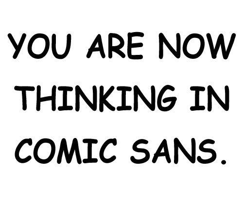
Hmm this isn’t so bad though really.
Chances are either you couldn’t care less about Comic Sans or other fonts, or you’re part of the subset of people who do (in which case you would likely never under any unironic non-meme circumstances use Comic Sans), or you might mock people who do use it, or you might even outright loathe it with a white-hot vicious hate. There’s usually not much of an in-between here. When it’s used innocently, it signals to a certain in-group a disqualifying ignorance or lack of basic aesthetic comprehension. Designer folks can take this stuff seriously.
I don’t think I ever hated Comic Sans, but I certainly would never have considered using it for anything, for fear of the shaming, derision, and loss of credibility that could follow.
But now I know I was wrong all along. Comic Sans isn’t just not bad; Comic Sans is heroic and good.
Why Everybody’s Wrong About Comic Sans
It was this thorough, enlightening essay by writer Lauren Hudgins that changed my mind.
Read the whole thing, but basically it’s important to understand that many people suffering from dyslexia convert text to Comic Sans to facilitate reading. As she writes in the piece, “Comic Sans is one of a few typefaces recommended by influential organizations like the British Dyslexia Association and the Dyslexia Association of Ireland.” It’s a life-enriching godsend to many people.
It turns out that the very reason some designers and type nerds despise Comic Sans — its whimsy, its unevenness, its lack of what any type designer would consider a coherent system — leads to irregularities that make each letter more unique and therefore more easily distinguishable from its counterparts. The upshot is that those irregularities circumvent the effects of dyslexia, since it’s less likely one character can be confused for another.
Ms. Hudgins says her dyslexic sister compares using Comic Sans to a hearing-impaired person using a hearing aid; it has enabled her to earn a degree in marine zoology. Even apart from her academic achievements, it has enabled her to read, something so crucial to our happiness and advancement that we take it for granted.
An ironic part of all this is that those who mock Comic Sans are themselves betraying their own ignorance and misunderstanding of it and its reason for existing, and not only for being ignorant of its capacity to alleviate the symptoms of dyslexia.
Beyond those noble reasons, Comic Sans was created for a specific purpose, and indeed can boast of a rather impressive lineage. As Ms. Hudgins reports:
Microsoft font designer Vincent Connare created Comic Sans — based on the lettering by John Costanza in the comic book The Dark Knight Returns — to be used for speech bubbles in place of the unacceptably formal Times New Roman. The font was released in 1994.
“Comic Sans was NOT designed as a typeface but as a solution to a problem with the often overlooked part of a computer program’s interface, the typeface used to communicate the message,” Connare says on his website. “The inspiration came at the shock of seeing Times New Roman used in an inappropriate way.”
Of course that old workhorse Times New Roman doesn’t belong in a speech bubble. Those attacking Comic Sans, and in such disproportionate fashion, are starting from a flawed premise. It wasn’t intended to be a type used in books or newspaper articles or what have you. And even if we all could agree on a “proper” time to use that font, limiting Comic Sans’s use would needlessly impede the ability of some people to read. And it was created as an homage to one of the most acclaimed graphic novels of all-time, in the Batman universe no less.
If there are haters out there who know all this already and still just can’t let go of their prejudice, perhaps that reveals issues of character far uglier than any amateurish typeface.
Look Again, You Might See Something
There’s another type of second impression that’s more about refining or enriching your original estimation of something, rather than correcting a false one.
A personal example that comes to mind is my appreciation for A Confederacy of Dunces, surely one of the finest novels published in the 20th century, with 1981’s Pulitzer Prize to back it up. (I do realize I’m playing to a stereotype here, but even so, nothing can take away from John Kennedy Toole’s achievement. It is an unqualified masterpiece, and Ignatius J. Reilly one of the all-time great literary characters.)
I loved the book the first time I read it. It struck me (and still does) as a work of comic genius. Our hero Ignatius in particular is uproariously funny.
I won’t give away the plot, but I will say that when I read it again years later, I detected another layer to the novel and to Ignatius especially. He was still incorrigibly hilarious on the surface. But I began to understand in a deeper way that the driving force of the entire novel, and of every action, reaction, and decision Ignatius makes, is his terrible severe depression. He is an intelligent and sensitive and eccentric person, but the most crucial aspect of his character is that he is in constant anguish and isolation.
You’re usually on dangerously shaky ground when ascribing personal characteristics to an artist based on his or her art, but knowing the story of John Kennedy Toole’s tragic suicide and the circumstances under which his masterwork was published at all, posthumously no less, makes this understanding of poor Ignatius, the larger-than-life, irrepressible force of nature rollicking through New Orleans and through the lives of his dumbfounded family and colleagues and neighbors, that much more poignant.
“One cannot read a book: one can only reread it.”
The notion that repeated readings, viewings, or listenings will enrich your experience and understanding of a work of art (or of an experience, or a place, or a typeface, or dare I say it a person…) is pretty much so obvious that it’s another cliché.
There’s so much out there to read, to experience, to see. It takes something really special to be willing to spend time with it again. But what if spending time with something again is the very thing that reveals that doing so is worthwhile?
And what if the second impression is your first opportunity to get to the essence of something at all?
As Vladimir Nabokov superbly put it: “One cannot read a book: one can only reread it.”
There are no right answers on this one, but the world would be a better place if we all tried not to rush to judgment, and came to understand not only how wrong we all are about more than we’ll ever know, but that there is a greater illuminating beauty to be found in just about anything when you take the time to look at it more closely — and then turn back again to look once more.
Posted on March 23, 2017.