Designing Thee with Science
Neuroaesthetics and the dream of empirical design.

My Beautiful Laundrette (2008) by Stephen Westfall. Image appears courtesy of the artist and Lennon, Weinberg, Inc.
*June 2021, Palo Alto, CA:
A young woman sits back in an aggressively fluorescent chair. She’s inside what can be accurately described as a conference-slash-romper room, which has been predictably decorated to reflect unpredictable zaniness. A meeting is about to commence.
The agenda: The woman’s powerful employer — a relative newcomer to the tech world that, although nobody saw it coming, is now an established giant after just two stratospheric years — is quietly expanding vertically, integrating a new mobile application to undercut some nascent competition (this is just one of many upcoming initiatives). Two internal design teams, having worked independently from one another, are now preparing to present mockups intended to define the app’s interface and user experience.
The plan is in its conceptual phase, but it’s behind schedule. A decision will be made today. (Everybody knows it could be tossed out the window at any time, but still.)
Each team enthusiastically presents its creative recommendations. The work of both is clean, vivid, powerful, intuitive — yet their results are strikingly different in style and seem to operate from conflicting assumptions about the motivations and behaviors of future users, not to mention the hierarchy of goals for the company’s next division.
The second presentation has just concluded and the designers have settled in expectantly. Our heroine is lasering in on the word “elasticity” written on the whiteboard in red magic marker in bubbly handwriting, which triggers a memory of that time at her last job when — suddenly, her reverie is interrupted by the fast-talking CEO (a rarity in Silicon Valley, he is 87 years old), who looks right at her and demands: “You there. You’re the ‘Director of Analytical Aesthetics.’ Tell me which design is…correct.”
…
Concession: The premise of the above scenario isn’t logically coherent. I.e., if the company has a Director of Analytical Aesthetics, why would two whole design teams be sent on wild creative goose chases? It would be her job to guide them toward empirically correct design, right? Oh well. Regardless, that assumption is the whole point of the dumb setup. Might there come a day when “correct design” can be determined scientifically?
About twenty years ago, two fields — neuroscience and empirical aesthetics — joined forces to create a new scientific discipline, one that could conceivably command increasing pull in the design world: neuroaesthetics.
Here is how neurologist, UPenn professor, and author Dr. Anjan Chatterjee sums up neuroaesthetics in a recent essay in The Scientist:
[There is] an emerging discipline dedicated to exploring the neural processes underlying our appreciation and production of beautiful objects and artwork, experiences that include perception, interpretation, emotion, and action. This new field represents a convergence of neuroscience and empirical aesthetics — the study of aesthetics rooted in observation — and is dubbed neuroaesthetics, a term coined in the 1990s by vision neuroscientist Semir Zeki of University College London.
Neuroaesthetics is both descriptive and experimental, with qualitative observations and quantitative tests of hypotheses, aimed at advancing our understanding of how humans process beauty and art.
Perception, interpretation, emotion, and action: I’d say that the design community might raise an eyebrow at each of those areas (particularly action). What exactly are these new neuroaestheticists discovering?
Chatterjee is also a co-creator of the Assessment of Art Attributes (AAA), which he says “allows researchers to quantitatively assess an artwork’s formal visual attributes, such as overall complexity, balance, and color saturation and temperature, as well as the qualities of its content, including abstractness, realism, and symbolism.” His research has found that the areas of our brains dedicated to classifying visual properties like luminance, color, and motion, plus “higher-order objects like faces, bodies and landscapes,” are the same areas used to assess those properties and objects. All of which sounds perfectly reasonable.
What’s more intriguing is the implication that unconscious neurological processes determine the values we impart to every object we observe in the world, be it a face, a horizon, a painting, or a website. It means that what we consider to be subjective appraisals are less within our conscious control than we’d probably prefer to believe. It also means that brain scans might be more reliable than an MFA in predicting what visual triggers people will respond to.
It’s not that science is inventing new aesthetic standards or pushing design and art in a certain direction. Rather, science is revealing existing standards that are hard-wired in our neurological framework. Science is catching up to art. For example, while the peak-shift principle (“the idea that exaggerated features enhance an intended response”) was first articulated in 1954, Chatterjee points out that it can be seen in artwork made in India almost a millennium ago.
Research also continues to support the “exposure effect” — namely, the theory that the more familiar we are with something, the more favorably we’re likely to view it. (Check out “Why the Mona Lisa Stands Out” by Ian Leslie.) This theory justifies marketers’ obsession with “impressions,” and even partly explains the reputation of the Mona Lisa, which wasn’t very famous until it was the object of a successful heist that shocked the world. But designers and marketers and artists shouldn’t get too excited; research has also shown that the exposure effect backfires when the subject being viewed is of inferior quality, again implying that the crux of our evaluations of art and other objects depend on unconsciously held standards of beauty. After all, the Mona Lisa might have been ignored for a while, but as Leslie points out, it had been hanging in the Louvre long before the heist too.
Here’s another example of an old painter’s trick that has more recently been deconstructed by science: the way artists create the illusion that objects are “unstable in their location, lending the painting that shimmering quality.” As Chatterjee explains:
Artists also capitalize on the way the human visual system processes information in two interacting neural systems referred to as the “what” and the “where” streams. Form and color are processed in the “what” stream, revealing an object’s identity. Luminance and motion are processed in the “where” stream, which reveals an object’s location. Viewers of some impressionist paintings . . . observe that the effect of shimmering on water surfaces or the sun’s glow on the horizon appears because the objects are painted with the same luminance but different colors. While the brain can identify these objects, their location is hard to fix, because the “where” stream does not register objects that have the same brightness as their background.
The example Chatterjee gives is Monet’s Impression, Sunrise. Below is another example by Danish painter P. S. Krøyer. Will designers be able to capitalize on knowledge of “what” and “where” streams and other neuroaesthtic findings? Say, to direct users’ eyes toward specific areas, or to influence their behavior within apps, or to manipulate emotional responses?
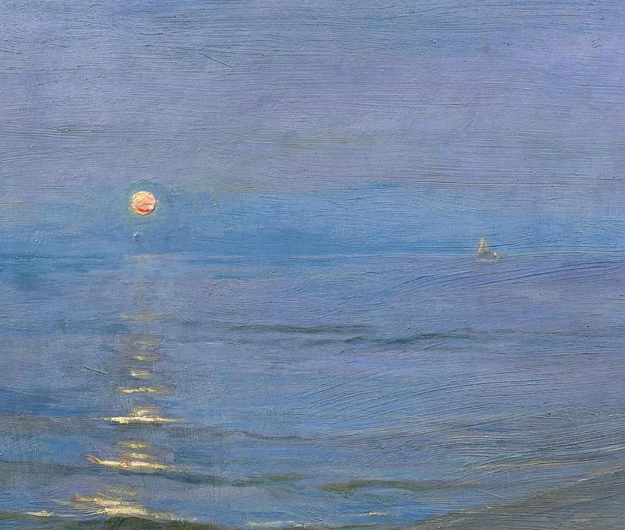
Summer Evening (1908) by P. S. Krøyer
While neurology is augmenting the study of empirical aesthetics, the search for universal aesthetic standards is not new. Hence the existence of organizations like the International Association of Empirical Aesthetics (founded in 1965) and the Max Planck Institute for Empirical Aesthetics, named for the legendary theoretical physicist. Again, it’s more that science is catching up and verifying long-explored ideas.
One of the most well-known recent proponents of aesthetic standards of beauty was the philosopher and internet pioneer Denis Dutton, author of The Art Instinct: Beauty, Pleasure, and Human Evolution. Basing his arguments on evolutionary psychology, he directly attacked conventional wisdom like “beauty is in the eye of the beholder” and the idea that standards of aesthetics are mostly culturally conditioned, countering that “taste for both natural beauty and for the arts travel across cultures with great ease.” While he didn’t discount observable differences in the art of different cultures, Dutton was more drawn to the similarities in taste and expression. These ideas led him on a search for “universal, cross-cultural aesthetic pleasures and values” based on Darwinian evolutionary history.
In 2010, Dutton gave a TED talk on the subject (“A Darwinian Theory of Beauty”; transcript here), in which he sums up his views on the subject this way:
I personally have no doubt whatsoever that the experience of beauty, with its emotional intensity and pleasure, belongs to our evolved human psychology. The experience of beauty is one component in a whole series of Darwinian adaptations. Beauty is an adaptive effect, which we extend and intensify in the creation and enjoyment of works of art and entertainment.
During his presentation Dutton touches on one area of “universally” human aesthetic pleasure: “the magnetic pull of beautiful landscapes.” Apparently the Ur-landscape humans tend to admire most, regardless of culture — the type seen on calendars, postcards, and landscapes both carefully cultivated in real life and in art — “just happens to be similar to the pleistocene savannas where we evolved.” This recognizable landscape type, according to Dutton, “is regarded as beautiful even by people in countries that don’t have it.”
Although it lacks Dutton’s requisite “copse of trees,” Microsoft’s old default desktop wallpaper immediately comes to mind here. (Did you know that it is a real photograph, not digitally enhanced? Photographer Charles O’Rear snapped the shot of the rolling Sonoma Valley hills on the way to visit his girlfriend — which is maybe why he titled it “Bliss.”)
Dutton’s arguments are persuasive but fail to fully explain aesthetic preferences. Even acknowledging that most humans will respond positively to an object or image featuring certain characteristics because of our exposure to similar panoramas or portraits or tools during our evolution, what about objects we find beautiful that couldn’t possibly have been programmed into our psyches over millennia?
Here’s a painting by Gustave Caillabotte. I’d argue that it’s quite beautiful, but how to explain it? Our ancestors probably wouldn’t have appreciated those murky skies or freezing snow, and they certainly couldn’t have comprehended a rooftop or chimney stack.
_-_Google_Art_Project.jpg)
Rooftops in the Snow (1878) by Gustave Caillebotte.
Or how about this stunning painting by Rebecca Litt:
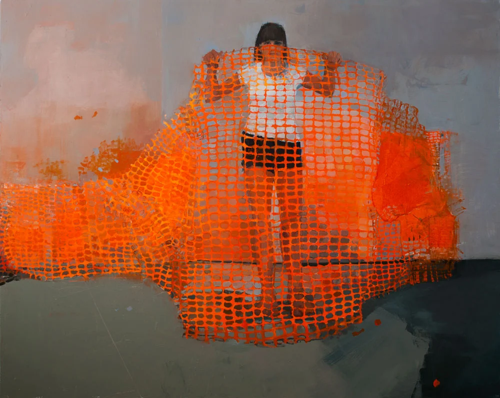
Intuition (2011) by Rebecca Litt. Image appears courtesy of the artist. See more of her artwork here.
In real life, upon encountering bright-orange, construction-zone-type netting similar to what is displayed in this painting, would you feel drawn to it? If anything it would be considered a blight on the street. Yet this painting exerts a strong pull. It’s hard to forget. The very idea of choosing the bright net as a subject is itself a brilliant artistic choice. Maybe some elaboration of color theory through neuroaesthetics can explain why it is so arresting? Or maybe the appeal of subversive choices such as this will be explained by other findings of neuroaesthetics? If the theory is to work, there can’t be exceptions all over the place.
As neuroaesthetics yields more insights into how our brains process information, maybe its empirical findings will increasingly inform the work of artists and designers. All the examples above are paintings, but perhaps the most useful benefits of the rising field will be found in elements of design less conspicuous than visual “surface” design, from interaction design and animation cues to navigation, information architecture, and industrial and product design. This Fast Company piece by Shaunacy Ferro, “Why Algorithms Are the New Designers,” delves into how computer-aided design (CAD) has influenced industrial designers in particular, although she concludes that “people are still better at making more subjective selections over issues such as aesthetics.” Will that always be the case?
It’s also possible that this brief look into neuroaesthetics is way behind the curve, that there are already designers and artists out there using research from cognitive science and empirical aesthetics for what we’d normally call subjective decisions. But I haven't seen any evidence of this with any of the talented designers I've seen in action (at times while curiously hovering over their shoulders and offering helpful comments, which creative people the world over appreciate and love and think is cool). It’s difficult to imagine their work being anything but subjective. It seems driven as much by unconscious decisions as by conscious ones, just as with any artist. This is why designers’ work often captures their personalities — just as with any artist. How could it be otherwise when they are creatively expressing themselves?
Maybe the dream of empirical laws of design is unrealistic, except in the broadest sense. That is to say, anything that we can deem a “universal” law will likely be so overly broad that at best it will reflect already-established principles of design, which is not the same thing, and would not be as applicable or influential in the nitty-gritty of visual arts and design. This is why another of Denis Dutton’s observations might be the most important takeaway from all this talk about how to design well and how to actively influence people’s perceptions, experiences, and actions: “Human beings have a permanent innate taste for virtuoso displays in the arts; we find beauty in something done well.”
So that’s the answer! If you want to be a successful designer or produce profoundly affecting art — you best do it well.
Wait. How do we define “well” again? I was staring at something.
Posted on May 9, 2014.