By Various Artists
If music distribution goes 100% digital, how will album art be reinvented?

Maybe our virtual-reality iTunes libraries will look like this? Vive la skeuomorphism! Photo Credit: Will Folsom.
A Trader Joe’s in Los Angeles has won a minor battle in humanity’s doomed war to make elevator rides less awkward and boring. The elevators conveying shoppers from its subterranean parking garage to its groceries have been decorated — lined wall to wall and just about floor to ceiling, in fact — with the sleeves of old vinyl record albums.
Artful isn’t quite the right word to describe the scene; it’s more whimsical than anything. I wonder whether an employee went down the road to Amoeba Music to select each album. Whoever was responsible, with a little imagination they transformed each elevator into a tiny museum.
Trudge through the doors for the first time expecting the standard-issue drab decor, and instead your visual cortex is set upon by a disorienting clash of colors and odd images. The arrangement of albums lacks any thematic organization (well, apart from kitsch), so your eyes never know where to rest. Gradually the strange artifacts reveal themselves.
Familiar names leap out initially, then give way to successively stranger, more obscure records, until the eyes again alight on something recognizable:
Simon & Garfunkel (Sounds of Silence) — legit. ABBA — haha oh yeah, them. Blondie. Fleetwood Mac. Frankie Avalon. Genesis (Invisible Touch). Donna Summer. Kenny Rogers. John The Coug’ Mellencamp. Days of Future Passed (a Moody Blues issue, it turns out — not the latest X-Men soundtrack). Bananarama…. Hmm. Teddy Pendergrass…. Kid Creole? Some dude named Pablo Cruise? Ah, there’s Sting. And just two albums over from Sting, there’s the soundtrack to The Sting. And not far from that, the soundtrack to Footloose. And way up near the ceiling there’s an album of Scottish folk dances, which I bet is pretty dope and that my Scottish grandma would have loved.
That might seem like a sufficient number of albums to decorate a whole elevator with, but there must be over 50 in each car — more than a person could register in the two quick trips up and down. It’s tempting to linger when the doors open and it’s time to browse repackaged foodstuffs of unknown provenance. By the time the return trip down to the garage has ended, the novelty hasn’t worn off, and the collection somehow remains both familiar and foreign. (Speaking of foreign, Foreigner is also represented.)
Why is it so fun to examine all those record covers? The unlikely venue is part of it, but it’s not just that. It’s not that they’re vinyl records — CD covers would be equally compelling. It’s not about the specific music being represented, since the selection is largely ironic and unfamiliar. It’s not about the apparent irony behind the choices either; allow someone with impeccable taste to curate the albums and it would be just as fun to peruse them, maybe more so. And it is fun — like flicking through the pages of a jukebox. It’s not about loving this particular music. It’s about loving music, period. And it seems that music’s cover art plays an underappreciated role in its perception and qualifies our affection for it.
Start talking about album art and it’s hard not to think back to personal favorites. I’m tempted to dive into the boxes of CDs tucked away in a closet to find some of the cooler ones. (Lots of people ditch their hardcopies after uploading them digitally. There’s even a startup that buys them, but to me the CDs are worth more than what Decluttr would pay.) Without having to rifle through the closet, some outstanding covers come to mind: The quaint oddness of In the Aeroplane over the Sea. The unforgettable violence of Rage Against the Machine. The self-referential lyrical allusions of Phish’s Rift. The sleek metallic sheen of 311’s Blue Album. That haunting “Lost Child” sign on OK Computer. The amusingly literal Ill Communication. The bold yin and yang color schemes of Use Your Illusion I & II. The eerie mechanical starkness of Automatic for the People (though it’s probably the title itself that I love best about that one). The freshness of Beck’s The Information, which was essentially just a sheet of graph paper that came with stickers, allowing fans to arrange their own covers. (“The CD cover is going to be designed so no two copies are the same; the artwork is going to be customizable,” Beck told Wired before its release. It was an innovative idea, though I never applied my stickers.)
Inevitably these conversations also lead to nominations for the best album covers ever (or the worst ones, though the internet has that plenty covered). Again, everybody has their personal favorites, but has any album cover been pored over as much as Sgt. Pepper’s? Its psychedelic colors have infused the music and vice versa: the very idea of its cover photograph (credited to artists Jann Haworth and Peter Blake) expanded the possibilities of the art form.
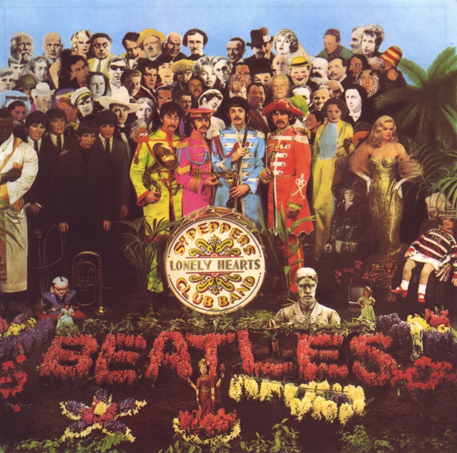
Each Beatle appears twice, which is odd enough, but what’s Bob Dylan doing on a Beatles album? Or Sonny Liston? Or Edgar Allan Poe? Or Aleister Crowley? Or Mae West, Marilyn Monroe, Marlon Brando, Lewis Carroll, Aldous Huxley, that Shirley Temple doll wearing a Stones t-shirt, Karlheinz Stockhausen, and — Karl Marx? Or any of these people, really. (Ever the firebrand, John Lennon wanted to include Hitler; somebody wisely thought better of it.)
That’s not the only Beatles contender. Abbey Road features what might be the most famous album cover of all; every day people trek to North London to recreate it. Revolver was groundbreaking in its way. And the White Album was — well, it was just completely white, wasn’t it. With a promotional style to match, its release wasn’t formally announced; the double album and its blank white sleeve simply showed up in stores one day, sort of the anti-Pepper’s (though the tiny lettering of the band’s name was embossed in the bottom left-hand corner).
“A lyrical portrait of one of London’s most peculiar tourist attractions...”
Andy Warhol created the iconic cover for The Velvet Underground & Nico, among many others. Artist Storm Thorgerson, who had gone to school with Syd Barrett and Roger Waters, designed the art for The Dark Side of the Moon — absolutely a front-runner for greatest cover of all time — as well as additional covers for Pink Floyd and other huge acts like Led Zeppelin.
It’s easy to see why creating album covers would appeal to many artists and designers. First off, everybody loves music, and working in the music industry carries a certain cachet. Vinyl records’ size also ensured a substantial canvas to work with. Even with the smaller dimensions of a CD booklet, any one album could have potentially massive reach.

Raphael’s The School of Athens (1509–10). A portion of this painting was used by Guns N’ Roses for their Use Your Illusion album covers. In a way, there is GNR album art hanging in the Vatican.
The physical formats of LPs and CDs limit what their corresponding visual art can be.* Use the space however you like — with photography or illustration or blank space or an optical illusion — but the end result will always be a two-dimensional print piece, perhaps embellished with elaborate package design, but always retaining the identical dimensions for that crucial front panel. And the imagery (or lack thereof) on the cover is then recreated for digital versions.
Collectors and vinyl enthusiasts notwithstanding, the average music consumer rarely encounters a full-size LP these days, despite the fact that vinyl represented the only sales growth across all music purchases in 2013 (and despite the fact that Pearl Jam’s Ten can be purchased on vinyl at Whole Foods). CD sales are plummeting (though digital sales fell 5.7% last year too). Even if a majority of music consumers never handle a physical LP or CD, every time anyone downloads something from iTunes, or Shazams an unfamiliar song, or plays a track on Spotify, there it is: the cover art, in that familiar square shape.
Of course, the reason cover art pops up in that familiar square shape is because physical covers for records and CDs are still being designed and printed, and that is so because physical CDs and records are still being manufactured.
But what will happen if (when?) the physical production of CDs and albums stops? It won’t happen overnight, or even in five years. But imagine the year 2039, 25 years from today. (For our hypothetical purposes, civilization and the music industry have somehow been spared from hungry hungry runaway nanobots, massive EMP disturbances, worldwide pandemics, and Skynet.) We can make some informed predictions, but there are technological advancements in store for us that we are incapable of imagining today. It’s not too much of a stretch to assume that recorded music will be consumed 100% digitally (or maybe it’s safer to say predominantly digitally and partly, I don’t know, bioelectronically? Or something?) — but 0% mechanically. There will still be some old coots (ahem) with antique CD players and record players for their priceless collections of oldies, but it’s very likely that a time will come when new music will no longer be distributed in analog form.
So, if there are no more new physical LPs and CDs being pressed, there will be no more album covers. If there are no more album covers, what will happen to cover art?

The off-kilter symmetry and vibrant colors on the cover of Here by Edward Sharpe and the Magnetic Zeros are mesmerizing. Its eye-catching design shows the art form is still alive and well.
The visual component of recorded, salable music is not going anywhere; the complementary form of expression is too useful, too powerful, too marketable. So, since it’s not going to disappear, it’s probably going to be reinvented.
Perhaps for a time artists will continue to use the familiar square shape of album sleeves and CD booklets out of habit and/or nostalgia. But somewhere down the line some creative soul may realize that the visual “covers” to their music are no longer limited by those obsolete constraints. Perhaps, instead of talented illustrators in the vein of Warhol and Thorgerson, bands will turn to designers and developers to create experiences. Maybe each download (or whatever we’ll call downloads in a quarter-century) will come with an interactive video, or a hologram, or its own virtual reality world to explore while wearing your immersive Facebook-Apple-Beats-Oculus iHelmet®.
The two outcomes aren’t mutually exclusive; innovation will continue (it’s not like musicians don’t already embrace creative uses of technology) but it’s possible that consumer trends will plateau or reverse, ensuring that CDs and albums will simultaneously continue to be produced. Flagging though those long-term sales projections may be, there are still many people who purchase physical copies to support artists, or because they prefer the sound quality, or because they love the physical objects themselves.
If the analog forms do go away, maybe iTunes version 37.2 will continue to display only the normal square cover images we’re used to. Maybe music fans will continue to prefer that skeuomorphic form anyway, regardless of whether it’s obligatory or no longer tied to familiar real-world objects.
And if someday music comes with holographic projections or virtual reality immersions, we’re going to have a lot more interesting things to discuss than the evolution of album art. I’d bet that kids in the 2040s will have no idea what CDs were anyway.
Then again I’d also bet that books will still be published — that is, physically printed — for centuries yet. So maybe the future won’t be so unrecognizable after all. Now excuse me while I go blast “20th Century Man.” See you on the flipside. God save the Kinks.
*Technology affects music, and music affects technology. Consider the size of CDs (and therefore their cases and their accompanying art) as we know them. Norio Ohga, then president of Sony, insisted on the current 12-centimeter diameter (the initial prototypes were slightly smaller at 11.5 centimeters) solely because the extra space was needed to hold the data for the longest recording of Beethoven’s Ninth Symphony in its entirety. That 4.3% increase in size might not be much in and of itself, but for a technology that demands uniformity, think of all it affected down the line. (That tidbit is from David Byrne’s book How Music Works, which I discussed more in a post about mixtapes.)
Posted on May 31, 2014.